Wednesday, June 3, 2015

Hello again!


Hello!

This blog was originally set up as a supplemental resource for the students I was teaching at the college level. Having been back in the thick of things as a full-time designer for the past couple years, I decided that I'd like to have a place to talk about design and save all the cool stuff I find online (and beyond!) into one place. This blog is that place, and I hope you enjoy poking around as much as I have enjoyed putting everything together.

I've left much of the educational element as is – I have found them valuable in various ways and hope others will, too.

I have been working in print design for many years and now find myself more and more interested in web design in its various forms. I am also a painter.

I love how design and art and life all intersect, and the content of the blog reflects this.

Thanks for reading!

Amy G.
Thursday, May 9, 2013

Process is Process

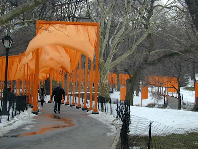
Christo and Jeanne-Claude, The Gates, installed in Central Park, NYC
"Design is about creating."

Design is about many things. This young designer, Henry Modisett (who is a student of a former graduate school classmate of mine), writes a thoughtful essay on all the things that design is to him, and speaks to the importance of not just the end result, but the process as well.

Wednesday, May 8, 2013

Google does Saul Bass

Poster design for Alfred Hitchcock's film Vertigo
If you're reading this on Wednesday, go to Google.com to check out their latest "doodle". It's an homage to the great designer/illustrator Saul Bass, one of my personal heroes.

If you missed it, have no fear – the internet has it available.

The master at work.
Beware, if you are doing some image searches for his work, there are many "homages" to Bass, where posters are created in an approximation of his style. Since he died in 1996, for instance, you can bet that he didn't design a poster for The Hunger Games or Burn After Reading. However, he also did not design Star Wars (which came out in 1977) posters, either. Do your homework before assuming it's a Bass original, my dears!

Monday, April 8, 2013

Notes on Exercise 3


The next exercise from our text is based on color interaction. The exercise is actually comprised of four activities, and I have some adjustments to the way I want you to put them together. You'll follow the instructions on how to do each of the four activities, but please set it up like this: One .ai file, with four artboards. So, when you open up the new file, simply enter "4" for number of artboards. Everything else can stay the same except for your page orientation, which should be landscape. 

Some notes about the way it's set up in the textbook/wiki: the authors divide what I am calling one exercise into four different exercises. Assured, go to chapter 5 and do ALL of them, which adds up to the ONE exercise I am calling Exercise 3. (See left sidebar for a direct link to the wiki page.)

I'd like to emphasize the READ part of that – yes, of course performing the exercise is the main thing, but the text that accompanies it is of equal importance, reviewing how color (and value) is perceived according to its context. 

>>>NOTE!<<<

There is an error in the last part of the exercise, Interaction of Colors. They seem to have reversed out the order of creating a complementary color and an analagous color – doesn't match up with the images they show coordinating with the text. I will highlight this point in the demo, so keep this in mind when you go to try it yourself! Remember, complementary colors are those that lie directly across from each other on the color wheel (i.e. red and green, yellow and violet, blue and orange). Analagous colors are neighbors on the color wheel, like blue and green, or red and orange, etc. So, if the center squares are green, one of the larger squares will be somehwere around red, and the other either yellowish or bluish.

You'll submit the native file (.ai) to submit on Blackboard. Please label it YourLastNameE3.ai, i.e. SmithE3.ai, etc.

Thursday, March 21, 2013

Inspiration: Graphic Design USA

Stefan Sagmeister


Check out the website for the magazine Graphic Design USA. It's a new discovery for me that I am happy to share with you as yet another source of inspiration.

Articles/lists of interest:

Favorite Album Covers of the Past Half Century

50th Anniversary Survey, lists and lists of important people in the design field chosen by readers

These will keep you busy – check out especially the the Most Influential Graphic Designers of the Past 50 Years – it's a wonderful list of people who should be on your radar as you continue study of graphic design.

Notes on Exercise 2


On Friday I introduced and demoed the next exercise from our text, based on symmetry. It's relatively simple and Illustrator-based using some of the tools and techniques you've already learned, so you should be able to finish it quickly.

Some notes about the way it's set up in the textbook/wiki: the authors divide what I am calling one exercise into seven different exercises. Assured, go to chapter 3 and do ALL of them, which adds up to the ONE exercise I am calling Exercise 2. (See left sidebar for a direct link to the wiki page.)

To put it another, simpler way, read the whole chapter and do everything contained within. :)

I'd like to emphasize the READ part of that – yes, of course performing the exercise is the main thing, but the text that accompanies it is of equal importance, reviewing the many ways that symmetry, balance, and focal point works in the parts of the composition (within each square) and within the whole composition (the six squares together on the page).

Please pay careful attention to the way you space things inside each square and on the page!

You'll submit the native file (.ai) to Blackboard. Please label it YourLastNameE2.ai, i.e. SmithE2.ai, etc.


Monday, March 11, 2013

Helpful Photoshop and InDesign Links

We will be starting to work with Photoshop soon. Have a look at the links below and start poking around as you begin an image search for the magazine layout project. There are also some helpful InDesign tips and tricks further down. Feel free to add your own findings in the comments section!

Photoshop

NEW! More Selections Seriously, so many approaches...

NEW! A Plethora of Selection Techniques While this was created for older versions of Photoshop, it is still a good resource that will introduce you to many methods of selecting an image. More than one way to skin a cat!

Confusing Terms Explained

Resolution and Print Quality

Image File Types

Making Complex Selections, part 1
Making Complex Selections, part 2

Transparency via Clipping Paths

Preparing Images for Layout Programs

InDesign

Using Transparency and Other Effects, also Layers

Misc. Tips and Tricks, Shortcuts

More Shortcuts

Placing Images Inside Text

Wrapping Text Around Images